I was looking for a framework I could use to make my blog. I wanted something lighter than Bootstrap and came across Skeleton. I also came across this tutorial series on TutsPlus on Building a Responsive Layout with Skeleton, and the accompanying videos.
The series turned into an unexpected lesson on web design. I learned about Photoshop mockups and their use in website design, about font pairing, responsive design, grid layouts, textures, patterns, media queries, and lots of other good stuff.
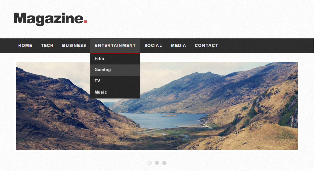
Checkout the resulting website here
It’s optimized for Desktop browsing.
Workflow
As I worked through the tutorials, I ended up tweaking some stuff,
- I changed the columns from the 7/3/6 layout of the tutorial to 7/4/5
- I played with the
<img>CSS such that you can upload non square images and they still look reasonably good. The goal was to avoid needing to crop or use thumbnail versions. - I also added stuff that was in the Photoshop mockup but skipped in the tutorials (in the interest of time/succinctness) such as
- Old Posts section
- Content inside Popular tab
- Styling for the search field & button (stitches, shadow)
- Here’s a link to the vanilla tutorial website for comparison →
- Flexbox!
- It’s so simple to use. Just two lines in lieu of several lines of hacky code:
display: flex; /* in parent */ flex: 0 1 auto; /* in child */ - I used it in the Old Posts and Categories sections, and the content inside Popular tab. And was very tempted to redo just about every other section on the website with it.
- It’s so simple to use. Just two lines in lieu of several lines of hacky code:
- Yet to be implemented -> for mobile browsers, I need to switch the layout around. For ex. push the Video of the Day, Old Posts, and Most Popular sections above the page navigation.