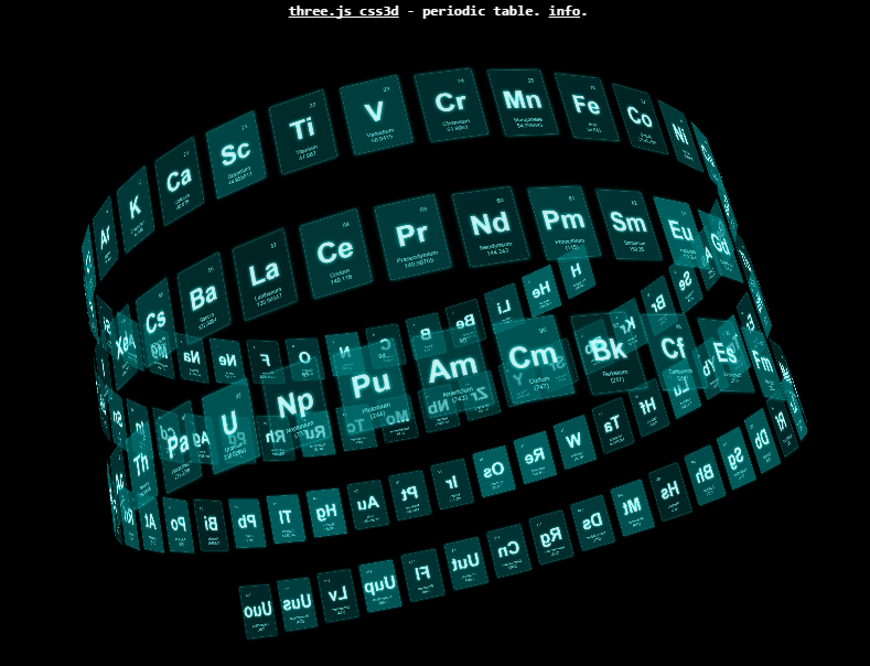
My inspiration for this project is Mr. doob’s CSS 3D Periodic Table. (Be sure to check it out!) I saw it about two years ago and it has since been in the back of my mind to use it as a base UI.
Why visualize mutual funds? People’s interaction with mutual funds tend to be very black box. You put down an initial amount and then get something in the mail every month telling you whether it went up or down in value. But what actually happens to your money?
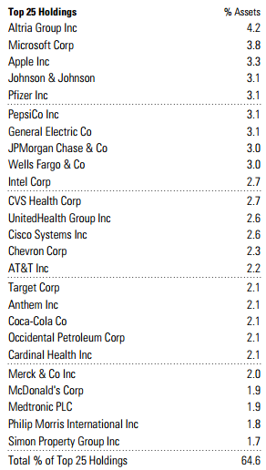
A fund’s constituent investments can often be found in annual reports available online. Sometimes these reports are also mailed to investors. However, they are quite a dry read. Interesting information is in them, but the presentation (pages of text and numbers) often leads to their overrepresentation in the “will probably never read” pile.
My goal with this project is to present this information in a cool graphical and interactive way (à la movie GUIs) that’s fun to use and hopefully reveals unexpected connections.
Tools I will use: Three.js, Tween.js, SVG, CSS.
I will blog my progress with this project. And hopefully in the end, have something neat that you can play with. Here’s the first update.
Update 1
I finished extracting the data from the annual reports (Management Report on Fund Performance). Here’s a download link for the reports I used. (Slogging through those PDFs was a test of will).
I also played around with how I could generate some pie charts dynamically. What I have come up with thus far is some JavaScript code that generates an SVG pie chart styled with CSS. Hit view-source on the demo to see what I mean.
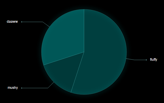
I also did a quick test to see if the SVG would work with Three.js. It does, phweks! (For some reason you first have to drag the mouse for the chart to be visible, but this is a problem for future self to solve).